Conversions
Website personalization examples: 15 ways to show each visitor the page they came for
By Alparslan Kapani · · 11 min read
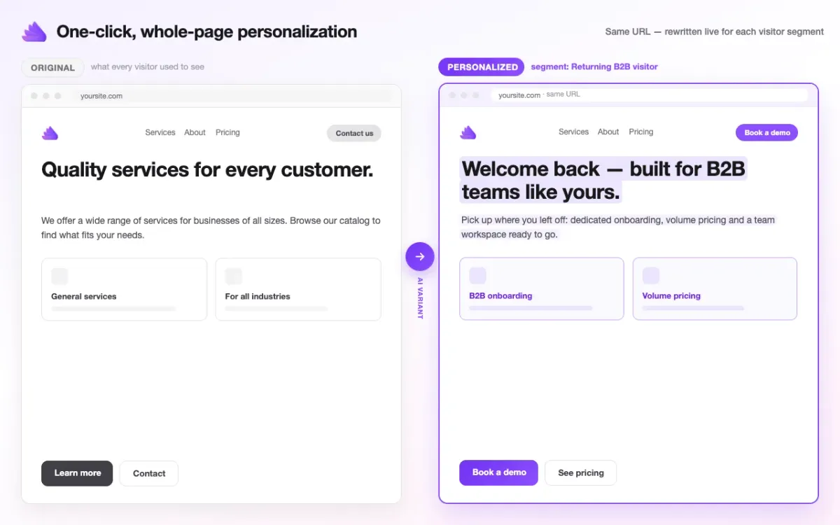
Website personalization means your existing page changes what it says for different visitors: the headline, the text, the offer and the button, chosen by where the visitor came from or what they did on your site. A visitor from your “weekend city breaks” ad reads about weekend city breaks. A returning business buyer reads about volume pricing instead of your general welcome. Same URL, same design, a different first screen.
Most guides on this are written for huge online stores, with product recommendations and Amazon-style examples. This one is for the rest of us: service businesses, schools, travel companies, B2B firms, anyone whose website exists to get a booking, an enquiry or a sale. I’ve grouped 15 examples by what triggers them, and for each one you’ll see who the visitor is, what changes on the page, and why it converts.
Key takeaways
- Personalize by what you already know: the ad, email or link someone clicked, what they did on your site, and what they typed or picked in your forms.
- Change the first screen first. The headline, the opening line and the main button do most of the work.
- Combinations are the real reason personalization pays: a handful of sources, behaviours and visitor types quickly adds up to hundreds of situations no set of landing pages can cover.
- Keep the same URL. Your SEO history, tracking and design stay where they are.
- Start with your three biggest visitor groups, not fifteen.
What is website personalization?
It’s showing different visitors a version of the same page written for them. The version is picked by a rule, called a segment: “came from the newsletter”, “clicked the brakes ad”, “picked 50+ employees in the quote form”, “read the pricing page twice but never got in touch”. When a visitor matches the rule, they see that version. Everyone else sees your normal page.
It isn’t a pop-up, and it isn’t a new landing page. A pop-up asks the visitor to stop and read something else. A landing page is a separate URL you have to build, track and maintain (here’s how a builder like Unbounce compares). Personalization changes the page the visitor is already on.
Why personalization increases conversions
Because the visitor stops searching. Someone who clicked an ad about weekend city breaks and lands on “Holidays for every kind of traveller” has to work out where their weekend trip is. Some will. Many go back to the search results. When the first screen repeats what they came for, the next step (book, enquire, buy) is right in front of them.
The research points the same way. McKinsey’s 2021 personalization research found that 71% of consumers expect companies to personalize, 76% get frustrated when they don’t, and personalization most often lifts revenue by 10 to 15%. The companies that do it best earn 40% more revenue from those activities than average players. An Epsilon survey of 1,000 consumers found that 80% are more likely to do business with a company that offers personalized experiences.
My own experience matches. I’ve seen customer engagement roughly triple and form submissions double once pages started answering each visitor type instead of talking to everyone at once. I run the same approach on our own site, convertus.ai, today.
For a lead-gen or booking site, that means more enquiries and more bookings from the traffic you already pay for. No extra ad spend.
Personalization by where the visitor came from
The easiest place to start, because the visitor has already told you what they want by clicking. Most of these work with UTM parameters, the small tags at the end of a link (utm_source=newsletter, utm_campaign=spring) that say where a click came from. If you don’t tag your links yet, our free UTM Builder puts them together for you.
1. The visitor who clicked a specific ad
Who: someone who clicked your “Weekend city breaks” ad. What changes: the headline becomes “Weekend city breaks — 2 nights, flights included”, the cards show this month’s city breaks, and the main button says “See this weekend’s trips”. Why it converts: the page finishes the sentence the ad started. Google likes it too: landing page experience is part of Quality Score, and a better score can mean a lower cost per click.
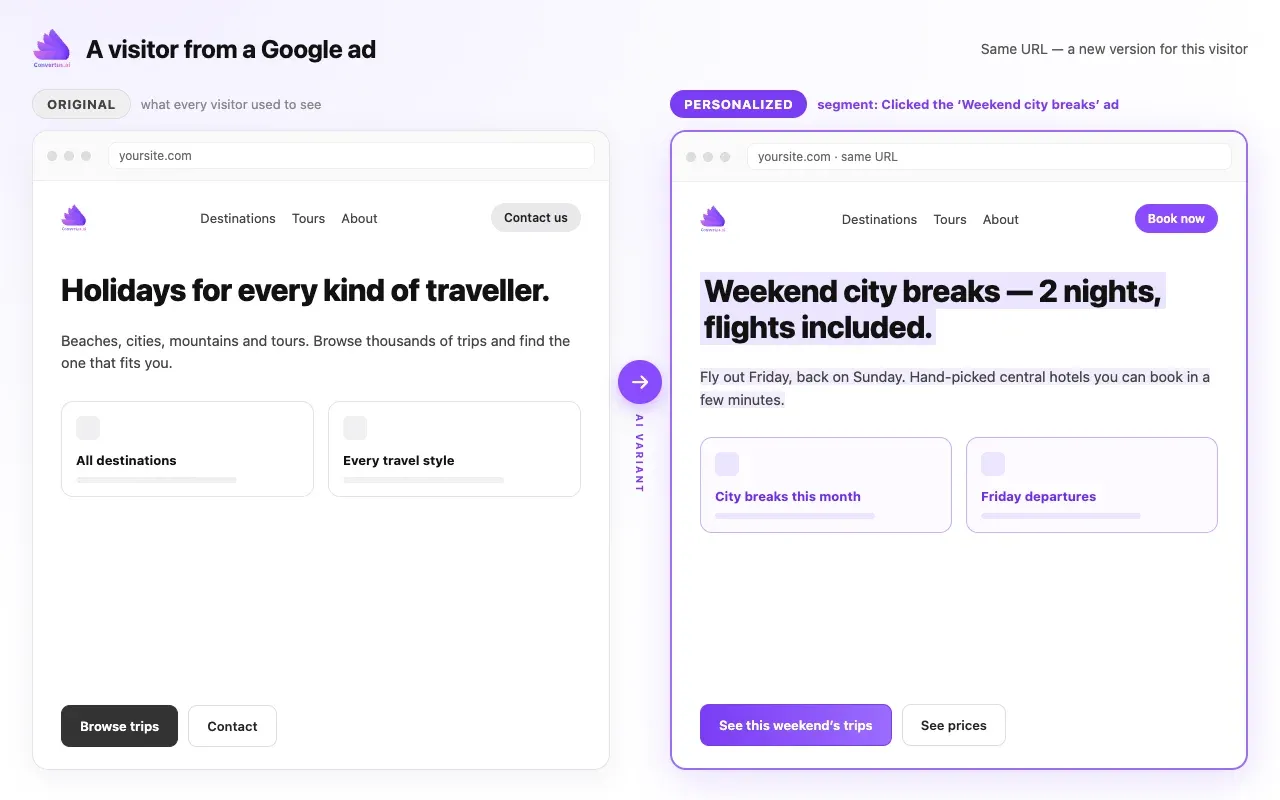
An illustration, not a client site: one ad, one matching first screen.
2. The visitor from the search term behind the ad
Who: someone who searched “emergency plumber open now” and clicked your general plumbing ad. What changes: the page leads with emergency call-outs and a phone number instead of your full service list. Why it converts: urgency. This person wants an answer in seconds, not a menu. One ad group can serve many search terms, and each can get its own opening line.
3. The newsletter reader
Who: someone who clicked through from your newsletter. What changes: they skip the “who we are” pitch. They’ve read your news already, so the page offers the next step: a tour, a demo, a consultation. Why it converts: you stop re-introducing yourself to people who already know you. That’s the warmest traffic you have.
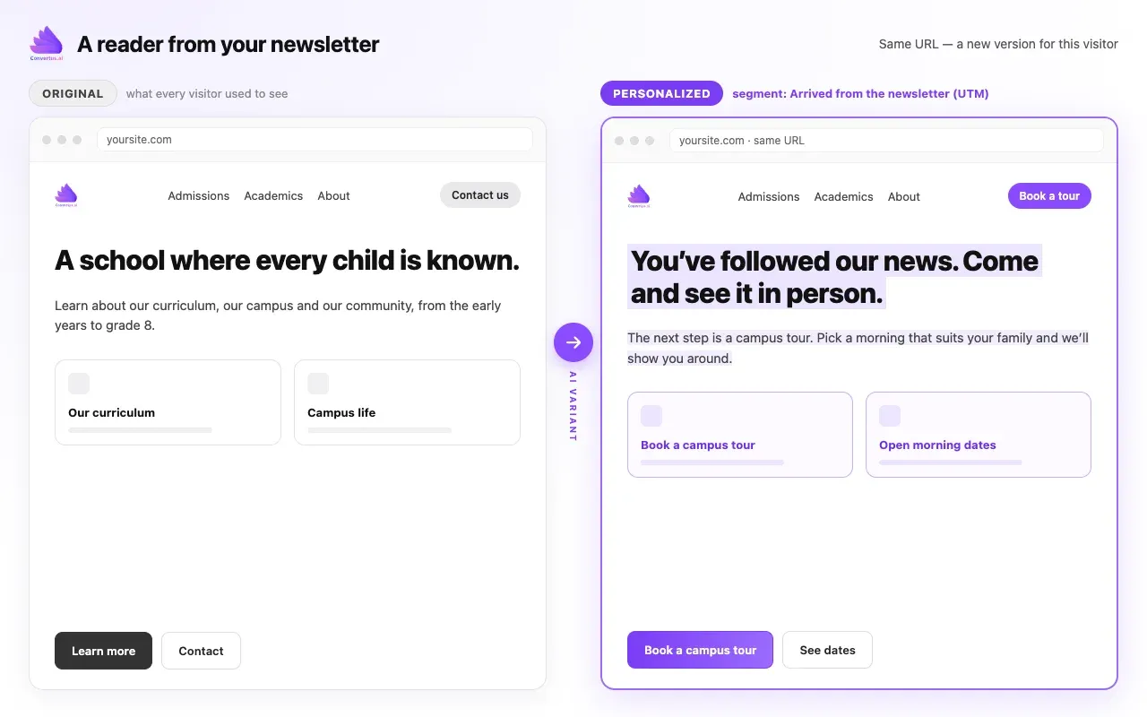
An illustration: the newsletter visitor gets the next step, not the introduction.
4. The visitor from your own social posts
Who: someone who clicked a link in your LinkedIn or Instagram post about a client project. What changes: the page opens with that project’s result and a short “want the same?” line. Why it converts: the post made a promise; the page keeps it. Without this, the visitor lands on your generic homepage and the story they clicked for is gone.
5. The visitor from a forum, review site or partner link
Who: someone who found you through a partner’s blog, an industry forum or a directory listing. What changes: the page acknowledges the source (“Welcome, [partner] readers”) or leads with the topic that thread was about. Why it converts: borrowed trust. They came because someone they trust mentioned you, so put that context front and centre.
6. The visitor from a regional campaign
Who: someone who clicked an ad or email aimed at one city or region, so the link says where they are. What changes: the headline names their city, the cards show the nearest location or the trips that leave from their airport. Why it converts: “near me” is one of the strongest buying signals there is. No IP lookup needed: the campaign already knows the region.
Personalization by what the visitor did on your site
Behaviour tells you how far along someone is. These examples use the actions visitors take on your pages, such as pages read, downloads and form starts, which most sites already track with Google Tag Manager.
7. The returning visitor who never got in touch
Who: someone on their second or third visit who has read your service pages but never filled in the contact form. What changes: “Welcome back”. The page skips the basics and leads with proof (a case study, reviews) and a low-effort next step. Why it converts: they’re interested but unsure. The second visit is where most decisions get made, and your page should know it’s not the first.
8. The pricing-page reader
Who: someone who opened your pricing page twice this week. What changes: the homepage leads with what’s included in each plan, the free trial, or a “questions about pricing?” call. Why it converts: price is the open question in their head. Answer it before they go and compare you with someone else.
9. The content reader who never enquired
Who: someone who downloaded your guide or read three blog posts on one topic. What changes: the page leads with the service that topic belongs to. Why it converts: they’ve shown you their problem. Showing them the solution is the obvious next step, and most sites never take it.
Personalization by what the visitor told you
This is where personalization gets precise. When a visitor types something into your search box or picks an option in your form, they’re telling you exactly what they want. If your site sends those values as events, the next page can answer them.
10. The dropdown pick in your quote form
Who: someone who picked “50+ employees” in your quote form but didn’t send it. What changes: the page talks to larger teams: a dedicated engineer, onboarding for new hires, team plans. Why it converts: they just told you their size. A page written for a five-person office won’t convince a 200-person company.
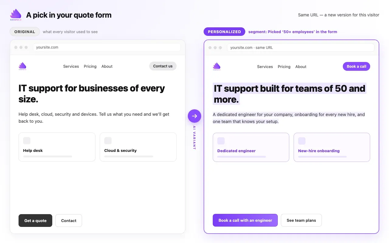
An illustration: one dropdown pick, a page written for that company size.
11. The site search term
Who: someone who searched your site for “wedding venues” (or “Grade 6”, or “Python course”). What changes: when they come back, the homepage leads with exactly that. Why it converts: a search box is a visitor telling you their need in their own words. Very few sites ever use that again.
12. The amount above or below a number
Who: someone whose quote request, calculator or budget field says “above $10,000”, or “fewer than 5 travellers”. What changes: bigger budgets see your premium service and a direct line; small requests see the quick, self-serve option. Why it converts: you stop showing premium pitches to small buyers and starter offers to big ones. Rules like “above”, “below”, “equals” and “contains” are enough for most of this.
Personalization by who the visitor is
13. Business buyer or consumer
Who: a visitor who came through your B2B campaign, or who picked “for my company” in a form. What changes: volume pricing, invoicing and onboarding instead of the consumer offer. It’s the example in the image at the top of this post. Why it converts: the two buy for different reasons, and one page can’t make both arguments well.
14. The visitor from one industry
Who: a visitor from your “accounting firms” campaign, or who chose “Healthcare” in your industry dropdown. What changes: the client logos, the case study and the wording come from their industry. Why it converts: people trust companies that have done it for someone like them. Check your menu first: if you already have an industry page they’d find, this one can wait.
15. New visitor or existing customer
Who: a logged-in customer, or someone who came from your customer newsletter. What changes: no “start your free trial” pitch. Instead, the upgrade, the add-on, or the new feature. Why it converts: selling to existing customers is easier than finding new ones, and pitching them a trial they’ve already used just looks careless.
Why hundreds of combinations make personalization hard by hand
Here’s the part most guides skip. Visitors don’t fall into one group; they fall into several at once.
Take a modest site. Six traffic sources (Google ads, newsletter, LinkedIn, a partner, a forum, organic). Five behaviours (first visit, returning, read pricing, downloaded the guide, started the form). Four visitor types (business, consumer, two industries). Three regions.
6 × 5 × 4 × 3 = 360 different situations.
A newsletter reader from London who read your pricing page twice is not the same visitor as a first-time Google ad click from Manchester. Add form picks and search terms, and the number keeps growing.
This is why “build a landing page for every audience” never quite works. Small teams build three pages, maybe five, and stop. Every page needs copy, design, tracking, testing and updates. The other 355 situations land on a page written for nobody in particular.
You don’t need a version for all 360. But the ones that bring most of your traffic deserve their own first screen, and you need to be able to add the next one without starting a project.
How to start: your first three segments
- Find your three biggest groups. In Google Analytics, look at your top traffic sources and landing pages. Usually it’s one or two ad campaigns, your newsletter and your returning visitors.
- Write down what each group came for. The ad’s promise, the email’s topic, the page they keep reading. One sentence each.
- Change only the first screen. Headline, opening line, main button. That’s where the decision to stay or leave happens.
- Tag your links. Make sure every campaign link carries its UTM parameters, or you won’t know who’s who.
- Watch the conversion rate per group, not just site-wide. A small site-wide change can hide a big change for the group you personalized.
Then add the next group. And the next. That’s where the combinations from the section above start paying off.
Where Convertus.ai fits
Convertus.ai is an AI tool for website content personalization and Google Ads automation. I built it because of the combinations problem: personalization was always worth doing, it just took too long to do for more than a few groups.
With Convertus you add one snippet (or, on WordPress, click one button in the plugin) and set up your segments by UTM, by what visitors do on your site, and by the values they pick or type, including combinations like “came from the newsletter and read pricing, but never enquired”. The AI builds the version for each visitor type in seconds: the whole page, not just a headline, with no editor and no landing-page days. You approve or edit every version before it goes live. Your page keeps its URL, layout, design, SEO history and tracking.
That’s how adding the next segment becomes a few minutes instead of a project. You can start a 14-day free trial, no credit card needed, and a free consultation is available if you’d like help choosing your first three segments. On WordPress, the plugin has a free-forever plan for personalization: 1,000 personalized page views and 50 AI-written variants a month.
If your visitors come from Google Ads, the dynamic landing pages guide for WordPress shows how to match each ad group’s headline, and the Google Ads setup guide covers tagging every ad group’s URL. The personalization product page has the full feature list.
Frequently asked questions
Does website personalization hurt SEO?
Not when it changes the content of your existing page instead of creating new URLs. Search engines crawl the original page, so your rankings, links and SEO history stay where they are. Duplicate landing pages are the version that can compete with your main page in search.
Is website personalization creepy?
It doesn't have to be. The examples here use what a visitor did on your site or where they clicked from: an ad, a newsletter, a form choice. Nobody is greeted by name and no personal data is needed. The page simply leads with the thing they already showed interest in.
How much traffic do I need for website personalization?
Much less than for A/B testing. A test needs enough visitors in each version to reach a statistical result; personalization answers a visitor you already understand, so it is useful from the first visitor in a segment. Start with the two or three groups that bring the most traffic.
What is the difference between personalization and A/B testing?
An A/B test shows two versions to everyone at random and keeps the winner for all visitors. Personalization shows each visitor group its own version, chosen by where they came from or what they did. Many teams do both: personalize by visitor group, then test inside a group.
Can I personalize a WordPress website?
Yes. The Convertus plugin connects a WordPress site in one click, and it has a free-forever plan for personalization: 1,000 personalized page views and 50 AI-written variants a month.